
Fixing The Experience
Redesign the customer portal app experience for a car loan company.
Project Overview
Objective
Redesign the customer portal app experience for a car loan company.
Problem
The app was supposed to provide access to loan status, payments, and vehicle-related information. However, navigation was challenging, crucial information was hard to find, and some data failed to display altogether. As a result, the app was not fulfilling its intended purpose.
Target Audience
Existing car loan customers.
My Role
UX Designer & UI Designer: Responsible for improving the user experience, including navigation, information architecture, and visual design. I also created an updated look and feel for the interface based on the brand style, incorporating animations into a demo prototype.
01
Problem Statement
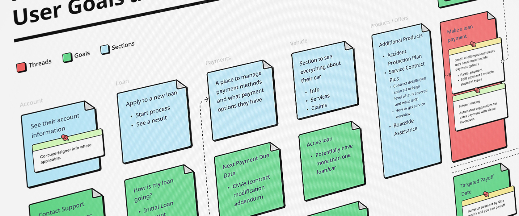
Customers needed to check their car loan status, payments, due dates, vehicle details, and access post-sales services. However, the app’s poor navigation, incomplete information, and complex registration and login flows hindered these tasks. Additionally, the app lacked important details like loan breakdowns and vehicle information.
02
Research &
Design Process
Conducted user interviews and examined how users interacted with the current app. Users often got lost in the interface, struggled to find key information, and didn’t receive the details they were looking for.
Created user flows and user goals/theards to map out where users faced friction and to identify areas for improvement.
Followed a standard design thinking approach: Empathize, Define, Ideate, Prototype.
Tools Used: Figma, FigJam, Proto.io, Photoshop, Illustrator.
Challenges:
Technical: The existing app was a web portal, requiring exploration and adaptation to create a fluid app flow.
Time Constraints: The prototype needed to be delivered within a 3-week timeframe, with only 6 hours of work per day.
Working/Fixing: I needed to iterate quickly, continuously exploring ideas while improving upon the initial flow and design.
03
The Solution
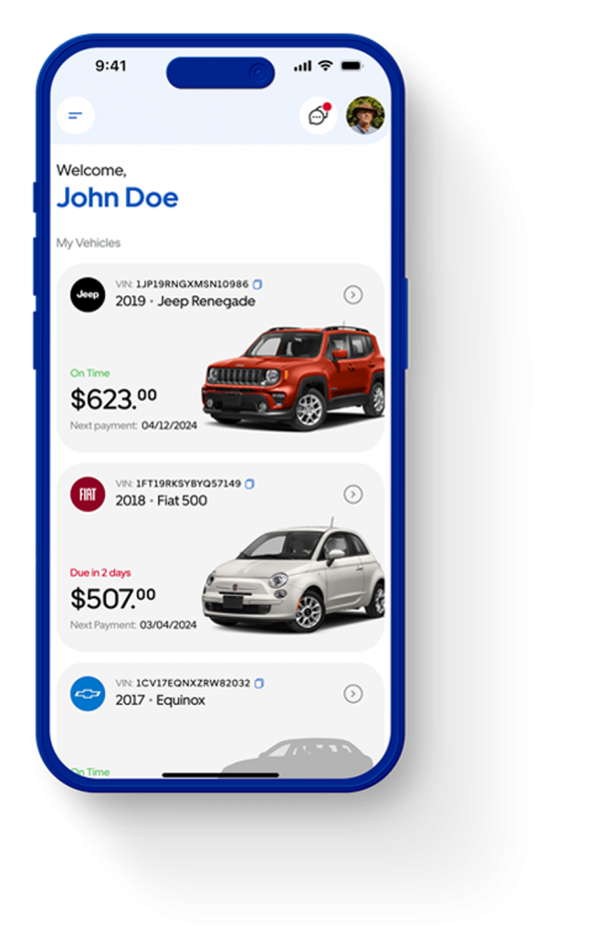
The redesigned app featured a modernized UI with enhanced navigation. Key information, like loan balance and payment due dates, was accessible directly from the home screen at first sight.
Users could also view detailed vehicle information, including VIN numbers, model, maintenance dates and other processes like how to start a claim.
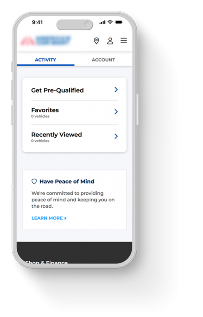
Added a marketplace where users could discover new vehicles and apply for a new loan.
Other features like up-sale maintenance service, start claims or schedule appointments with an agent.
User testing showed positive results, with users finding the new experience intuitive, quick, and providing unexpected but helpful additional features.
First impressions pointed they loved the new look and feel.
04
Takeaways
I learned how to communicate effectively with stakeholders, understand their struggles, and help them see the bigger picture that aligned with both their goals and users’ needs.
I would prioritize more user testing throughout the process and continue honing my presentation skills to better convey design decisions.